Support discovery without overload
Organize categories using language customers understand. Give search and filtering a clear purpose, especially when the catalog is large. Avoid placing every promotion ahead of the products. A useful browse screen helps people narrow the choice rather than requiring them to decode the business’s internal organization.
Make product detail do the work
Customers need more than a picture and a purchase button. Show the information that affects the decision, including variants, availability and the details relevant to the product. Keep the selected option visible. If a required choice is missing, explain it next to the control instead of returning a vague error.
Keep the cart understandable
Reflect what has been selected and make quantity changes clear. Explain when the total changes and surface important additional charges before the final decision. Preserve the cart when the user leaves to check a product detail. A purchase flow should not punish a person for double-checking an important choice.
Design after the order
An order confirmation should describe what happens next and where the customer can find help. Consider delayed, canceled and partially fulfilled orders in the product scope. The experience continues after payment. Reviewing those states early helps the development team build a more complete service rather than only a successful checkout demonstration.
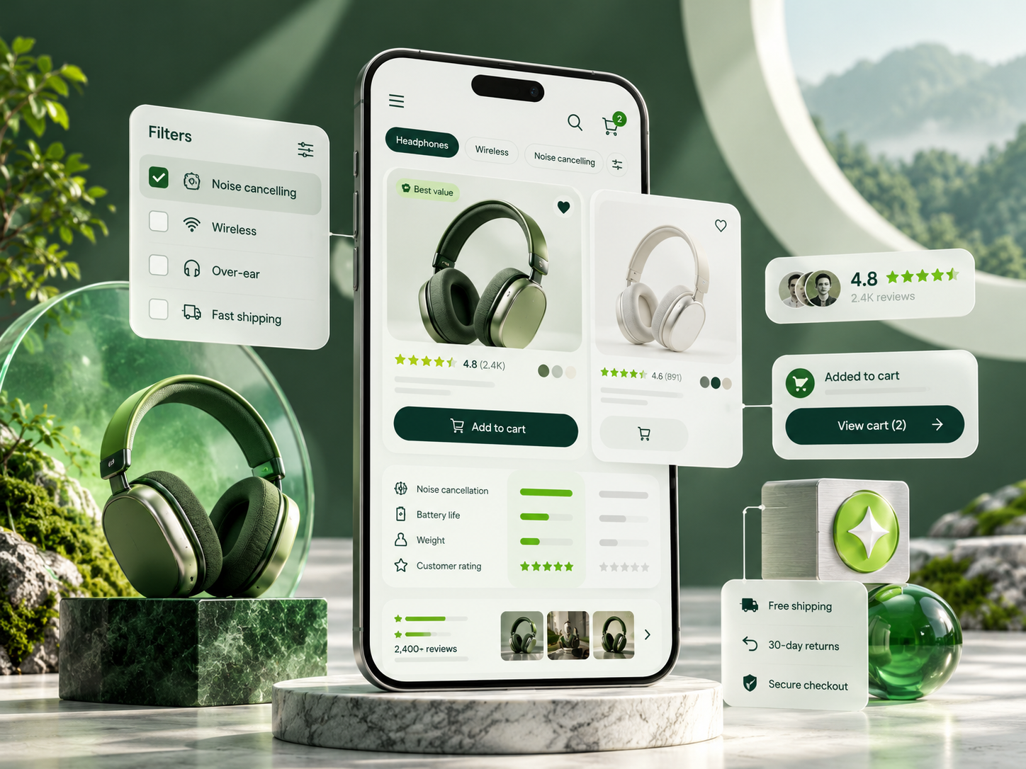
Example: selecting a product variant
A shopper opens a product that comes in several sizes and colors. Keep the available choices clear and show the selected combination near the purchase action. If one combination is unavailable, explain that state at the relevant choice. Do not wait until the final step to reveal the problem. If a shopper changes color after selecting size, make it clear whether the size remains valid or needs to be selected again.
Create a usable filter experience
Choose filters based on meaningful product differences and show the active choices when the user returns to the results. Let people clear one filter without losing all the others. Distinguish no matching products from an empty catalog. On mobile, preserve the browsing position when opening and closing a product. These small decisions reduce repeated work and help shoppers compare options without feeling that the app resets after every action.
Review the order summary carefully
The final review should make the selected items, quantities and relevant charges understandable. Use the same product names and options throughout the journey. If a value changes, explain why before the user commits. Consider what happens when an item becomes unavailable or a request fails. The app should preserve enough information for a sensible retry and communicate whether the order was actually created.
Test with a realistic purchase task
Give a participant a specific need and ask them to find a suitable item, compare alternatives and complete the intended flow in a test environment. Watch where they hesitate and what information they seek. Avoid directing them to the correct control. Their behavior can reveal unclear labels, missing product details and unnecessary steps. Use those findings to improve the journey before focusing on decorative interactions.
